A magazine design consisting of masthead, cover, imagery and the typesetting for two pieces of writing about typography.
The essays, one by Ellen Lupton, the other by Kenya Hara, speak to the use of white space and the evolution of typography respectively. The imagery created aimed to capture key concepts within each essay.
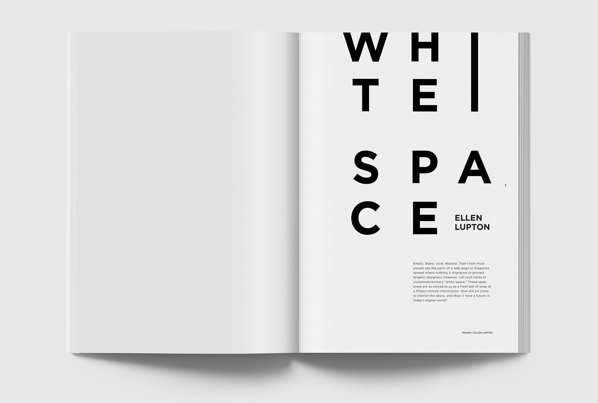
Ellen Lupton’s article was typeset purely typographically, playing on the notion of increasing the white space as around the blocks of text as you read, using pull quotes to create visual interest in context.
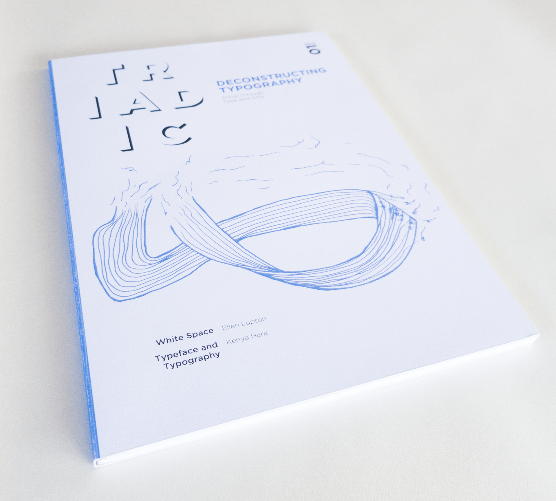
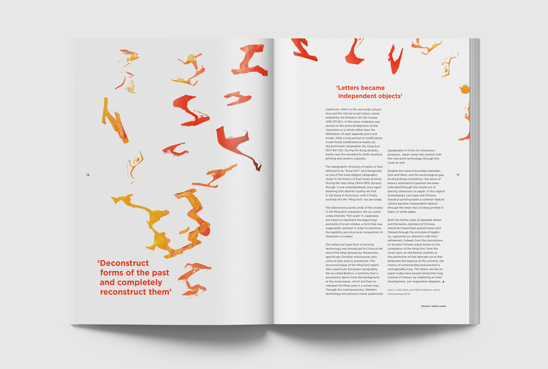
Both the cover and imagery for the Kenya Hara article were designed as a response to the quote in the essay ‘Deconstruct forms of the past and completely reconstruct them’.
The cover has a mobius strip that is constantly being woven and undone, whilst the inner imagery consists of the fluid and organic forms of a ‘T’ being stripped of its expected form.
The cover has a mobius strip that is constantly being woven and undone, whilst the inner imagery consists of the fluid and organic forms of a ‘T’ being stripped of its expected form.
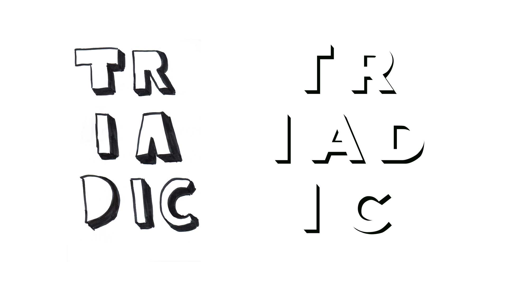
Being a typographic magazine, the masthead ‘Triadic’ was designed as a play between black and white similar to all type, placed in three rows as a reflection of its definition. The initial hand drawn one (left) went several iterations before arriving at the final (right).