This website design is a creative response to a feature article for The Guardian by Alison Benjamin. It aims to bring to life an otherwise text-heavy editorial piece by lifting it and communicating its contents effectively through the affordances of the digital space.
Through interactivity, strong visuals, data visualisation and careful editing of text, it reinforces the sense of wonder in the form of a clean and poetic experience that highlights the stunning aspects of bees.
Imagery is combination of self-generated vectors, sourced stock images and sourced video.
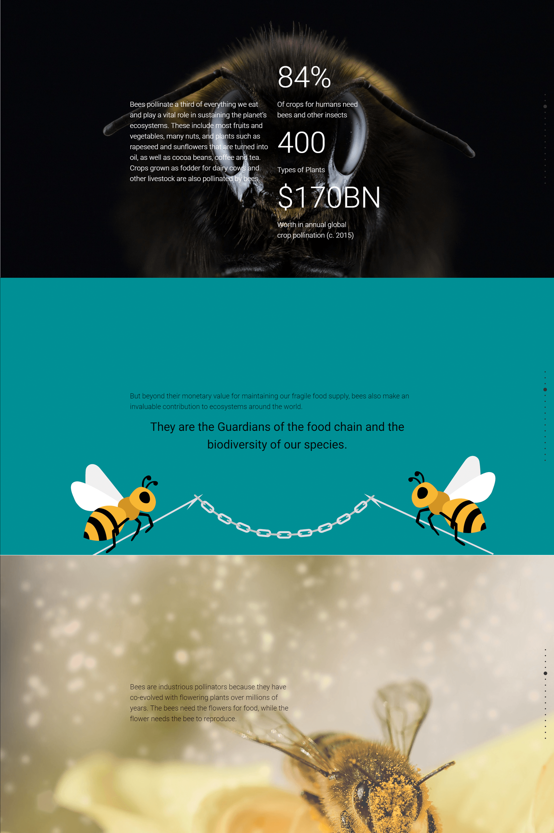
In some ways the article went into great detail, in other aspects it did not. As such to better communicate parts of the article, further information was researched to give greater depth to the article, but also visualised in order to quickly convey the concept without paragraphs of text. In other instances, the use of video was a far more elegant solution than to get more information.
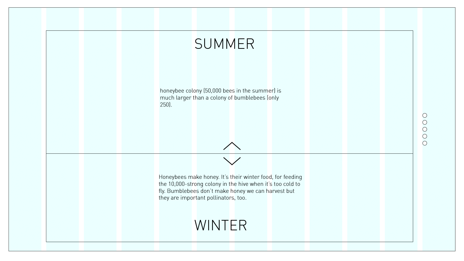
Part of the process included making style guides and wireframes. This part of my process was extremely important as I was able to visualise how dense the text would be when on screen as paragraphs, and prompted me to go through and edit and reduce the article down so that it was much more readable.
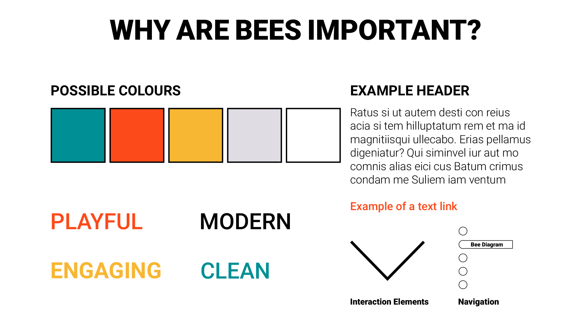
A rough style guide was created prior to the beginning of development in order to pin down the personality and tone of the article that I wanted to create.